Work / DESIGN
“Ana Hanadi” — The Book
Editorial Design Typography Print Production Amna bint Wahab Primary School 16 pages
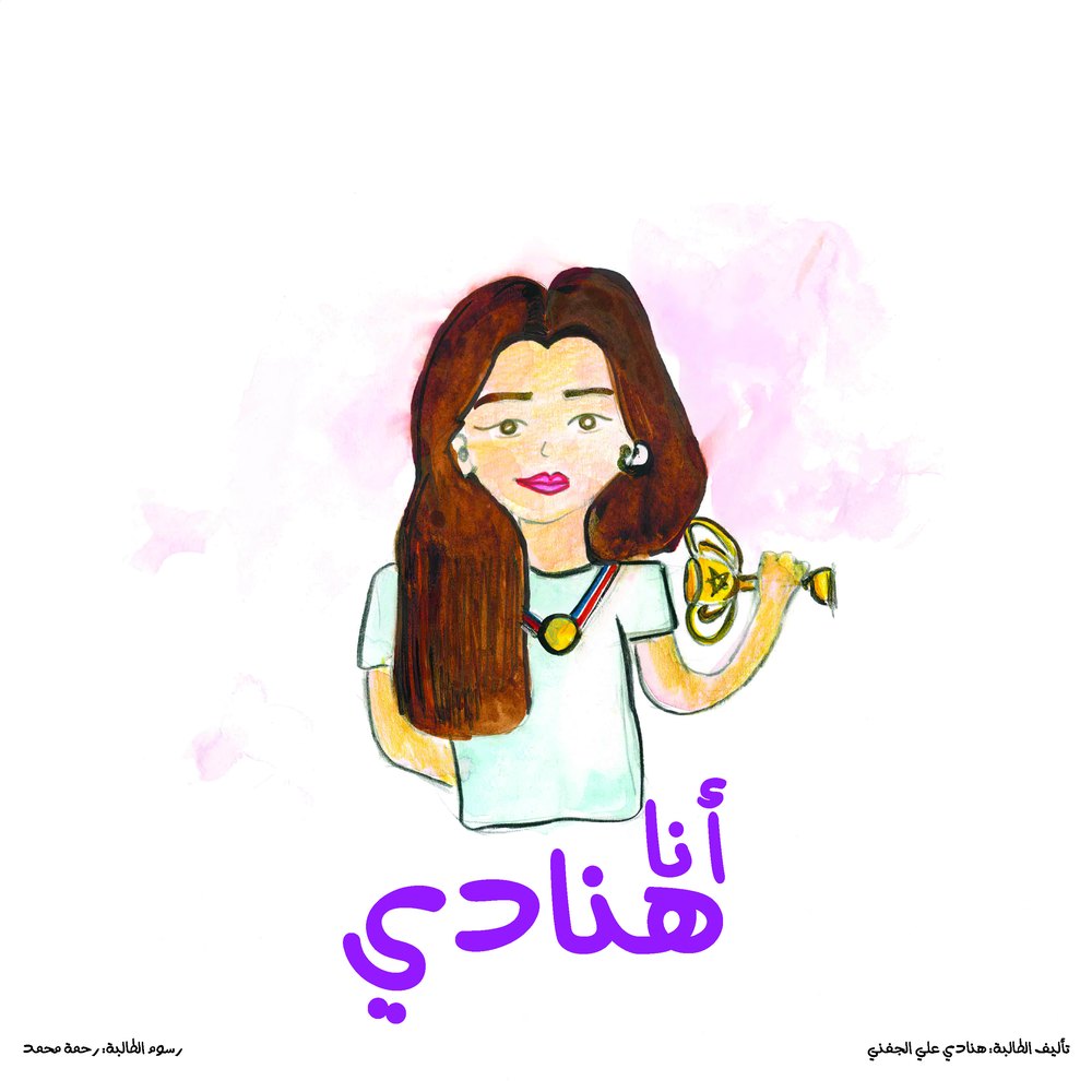
The brief
A 16-page printed storybook telling the true journey of a hearing-impaired student at Amna bint Wahab Primary School — written by Hanadi herself, illustrated by her schoolmate Rahma Mohammed, and published by the school.
The approach
The one rule that governed everything: the children's work is the book, and the design serves it. Every hand-drawn line was preserved as the pages were rebuilt digitally for print — nothing was redrawn, cleaned up or replaced with an illustration that looked more professional. Typography was set to sit around the artwork rather than over it, at a size a primary-school reader can follow.
My role
Typography, layout, colour management and print production. The story is Hanadi's and the illustrations are Rahma's.
Rebuilding a child's drawings for print is mostly a colour problem. Marker and pencil on paper carry tones that sit outside what a press can reproduce, so each page was profiled and adjusted so the printed sheet matched what the girls actually drew rather than what a screen suggested it was. Arabic type was set with generous leading and a large body size, margins were built to survive trimming and binding, and the sixteen pages were imposed so a spread opens flat without a fold cutting through artwork.